Today we will consider the problem of effective space using on the screen.
Is there a lot of space on your screen? Is this space effectively used?
To answer the second question we will consider some typical situations regularly arising in the work with the application with modern interface OpenOffice.org.
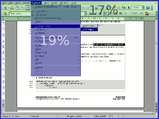
Suppose, we have selected the text and, having decided to change its register, have opened the menu "Format". The appeared menu takes 19% of the total screen area.
 |
19% may be not much if consider that the toolbar always takes 17% of the area of the screen. But see in more details that has occurred:
- The main toolbar is not accessible with one click. Moreover about 20 % space of this panel is blocked by the opened menu and becomes inaccessible even for viewing. One fifth of the screen is absolutely useless.
- The fifth of the working area in which the document is displayed, also is closed. We don't see a part of the selected text on the second line. With high probability the cursor is hidden and we cannot move one to any place with one click.
- Only 19 % area of the screen are really effectively used. Whether are ready so easily to lose more than 4/5 areas of your screen?
For the sake of justice, it is necessary to notice that there is one application in which the situation in this question became much better. It is Microsoft Office 2007, all it's menus are turned to toolbars not blocking working area of the screen. "Was it good made?" is another question, but it is precisely that the area of the screen with the new Microsoft product is used more effectively.
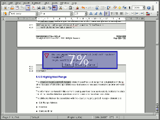
The next example is related with dialogs. One of the smallest of them, is dialog with question whether you need to save changes at document closing.
 |
Here:
- We lose 7 % of screen working area. It seems very little. But I will repeat: "you lose 7 % of the central screen part", i.e. the part to which is directed eyes most time. What if it is the document part which would remind you what exactly you have forgotten to save?
- Reduction of effectively used space more than in 10 times
- Some dialogs (with error messages) can appears absolutely unexpectedly and they distract the user from work which he/she makes. Jef Raskin besides this dialogs feature directly points that if the dialog suggests to read only the information and to close it then its information efficiency is 0. You nothing can to say against this, you can close only the window, and it already imposing to the user of actions order.
- Possibly, the few know that browser Firefox last years co-operates with the Humanized company, headed by Aza Raskin (Jef Raskin son). Some yields of this cooperation have solved these problems in one taken application:
- In Firefox has appeared the incremental search. It means that you see results of the search on the screen, without finishing a typing. You know at once whether it is necessary to add some additional letters or enough of typed ones. The search toolbar does not block the central part of the page, and occupies a narrow strip in the bottom of a browser.
- The majority of dialogs are turned to toolbars which appears in narrow strip at the top of a browser and disappears when user goes to other domain. The browser does not demand now the immediate answer to a question like "Whether it is necessary to save the password". You can to don't answer at all: by default accepted answer will allow you to return to the question later when you again will appear on the same site. However the same behaviour is now inherent also for some annoying questions in the Opera browser. And I don't know, where similar changes have occurred earlier.
As to information efficiency of dialogs (the quantity of the information which transferred to system when user answers to the question) here recently there were improvements not only in the Firefox. In particular, for example, the Gnome end of a session and power off dialogs, automatically makes the decision chosen by default in case the user does not answer it within 60 seconds.
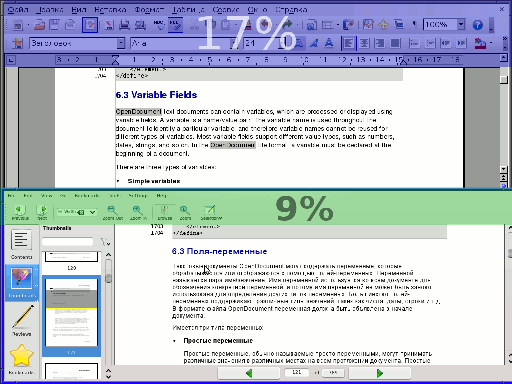
Last example of this article is related to a situation when it is necessary to open for some reasons two documents simultaneously. For example, you need to copy something from the PDF document in which copying through the clipboard does not work, or it is necessary to compare two documents:
 |
In this case on the screen there are toolbars at once two applications. The area taken with its makes more a screen quarter. If to add to it title bars and task panel usually presented on the modern DE screen the cumulative area inefficiently used will reach third of screen.
To solve the given problem within one application the so-called Multiple Document Interface is used. However this way helps only for documents opened with one application. In a case shown on the picture it in any way does not work.
In the unDE project will be implemented:
- Replacement of all menus with contextual toolbars. Quite, probably also it will be possible to release the right mouse button from function of the contextual menu call - I sure it is possible to find more successful application for it.
- Instead of information dialogs for the reports to the user the message console will be used.
- More difficult dialogue windows will or be located in specially taken away area of the screen without closing the document, or will be developed on all working area of the screen.
- The single contextual toolbar for all documents will always show on the screen only the buttons necessary at present. Opening of two documents simultaneously will not mean additional reduction of working area of the screen.