I am sure that even the most die-hard fans of graphic interfaces and "mouse" manipulator agrees with the statement that to enter the text with virtual screen keyboard is far less conveniently, fast and practical, than using one with real keys.
But with another, as a matter of fact related, the statement: "Shortcut keys is much more convenient than buttons on the toolbar" many will argue. No, that on a key often to press much faster, than on toolbar button, I think, it is not necessary to convince anybody. That's not the point. To remember and always easily to recollect hotkeys, it is necessary to repeat them often at least. And toolbars never remind of these shortcuts at usual usage. I.e. if you do not remember/know the hotkeys and instead of these simply use toolbars you never learn and remember it.
To solve this problem we will try to create toolbars a little original way. We will not allocate the buttons on toolbars arbitrarily and we will not arbitrarily assign shortcuts. Instead we will allocate one virtual keyboard on the screen and directly on its buttons we will represent meaning of each key. I.e. in text entering mode it will purely display characters, and in a command mode - commands.
Thanks to such approach in unDE two remarkable properties of system will be reached:
- For any command on the toolbar the assigned hotkey will be remembered easily thanks to its visual association with layout of keys on the keyboard.
- At creation of a shortcut for a command the button on the toolbar will be automatically created also.
However, the standard virtual keyboard is too large. Even if to leave only alphanumeric keys with modifiers, such keyboard will occupy considerable space on the screen:
 |
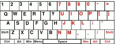
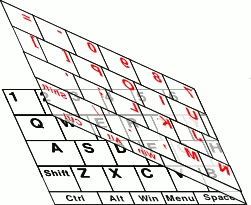
To reduce occupied space we will fold the keyboard double approximately so:
 |
On the result keyboard, black sign on the button is its value of left mouse click, red - value of the right click, and grey - the middle click.
 |
Certainly, on-beginning using such folded screen keyboard will be not habitual, but a little using it, it is possible to print even faster, than on full, due to:
- Reduction of necessary moving the mouse at a choice of the following letter.
- Frequency of clicks which can be above at alternation of fingers (for the left and right button) by which it's carried out.
Approximately also key press speed increases on the usual keyboard at using two hands instead of one.
The way of keys grouping on the screen keyboard which we name mirror, has the next advantages:
- Close keys are allocated on close buttons even if they get on different half of keyboard.
- It is always easy to define, by key layout on the real keyboard, its layout on the virtual one, and on the contrary. The rule - all keys being with edges (left and right) of the real keyboard, allocates in the left part of the virtual keyboard, and all keys from centre - in right.
- The left and right keys-modifiers naturally unite in one button. Thus the left click designates pressing of the left key, and right - right.
The keyboard panel in unDE will be always allocated in the right lower corner of the screen. Due to this, as noted in the previous article "The way of screen space saving", reduced buttons at the bottom and on the right edge of the panel will be so easy (and even easier) to press as well as all the others.
Also we will especially mark corner layout of the spacebar. It will be easy for pressing as well as real after any other key, simply fast having put a mouse pointer in a screen corner.
Since the keyboard has one spacebar, the left and right mouse clicks on this button means the same thing. The middle click means "Enter" for easy pressing as enough often used key.
As to the second "Enter" on the "3" ("0") button, it also as grey "-", "+", "*", "/" means so-called Gray keys on the numeric keypad.
In general for additional saving of screen space it would be desirable to allocate buttons strictly under each other. But unfortunately it leads to loss of association the panel with real keyboard. Why buttons on the keyboard are allocated so fancifully? In the Internet you can find many interesting suggestions on this topic. However, the real reason of it is opened, perhaps, by the following picture from site of famous russian designer Artemy Lebedev:
 |
It is clearly seen that if typewriter keys were placed the under each other, type bars simply would merged. The first typewriters have appeared in the second half of the XIX century, and the technical problem of buttons layout has arisen then. As you can see to overcome, the institution for technical reason, the situation is not possible even in the XXI century with virtual keyboard development which has radical different technical implementation.
How much really successful will be the idea of usage of the screen keyboard as toolbars will show the practice. However I am sure that it will interest many future unDE users.